
Our New Year’s Art Sale continues on Fine Art south through February!
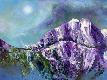
Art is more than an interesting thing to look at. Any finished painting – of any genre – is the culmination of a series of decisions, big and small. Artists read and write articles about how and when they decide a piece of art they have been working on is “finished”. What they mean by that is they are making the final decision as to when everything looks right – it’s the ultimate decision. But along the way, there are many other decisions. Look at the progression of this painting for an example of how decision making is important in painting. This is an oil painting I have just finished. Along the way to the finished version, I had to make a lot of decisions and I changed my mind a few times in the process. The decision-making is sometimes very tough, from what colors to use, to what type of art materials, to size, etc., but it goes much deeper than that once the painting is in the process of being actually made.
Purple Mountain Majesty is a new small oil painting on panel (for sale here). I chose panel because I wanted a hard surface to use a palette knife on. A canvas can bend too much if you use knifes and even some heavier paint applications, so a panel is often the correct thing to use if you want to use non-brush non-thinned paint, especially oil paint. So I started out just thinking of blue, purple, and green, and applying paint in areas that were generally landscape-oriented. It was meant to be an abstract painting, but like a lot of abstracts I start, I often end up going in a slightly representational direction. (That’s OK, because despite what you may have heard, there are no rules in making art.)
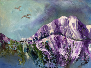
After the initial paint application, which was much more abstract than this, I added more storminess to the sky, added a polar bear, added more reflective paint below the mountain, defining a sort of reflective “lake” to emphasis the polar bear’s plight (melted ice). Then I added birds, but there were huge problems with adding the birds. #1 was the problem of the birds appearing much larger than the polar bear. The 2nd problem was an old cliche, highlighted on an episode of Portlandia.
After thinking about these problems, and the other problem of the large birds distracting from absolutely everything else, I removed them and replaced them with more clouds and with a sun. Now I was back to my more dystopian view of the future and the bear, and the whole thing makes more sense. This is the finished painting.
There were more decisions than this of course, as with all paintings. The first decision is what colors you are going to use, and this is a harder decision than a lot of people would think it is. I think the difficulty of choosing colors to be used in painting is why so many abstract paintings end up being all blue, or beige with a streak of red. People making these paintings are worried that they will offend potential buyers with bold colors.
I purposely seek out bold and unique colors in my work, because bold colors stir up memories and feelings in people. Certain bold colors can make people mentally bond with the painting. Colors can be very emotional on a subconscious level. I also try hard to avoid cliches in my paintings, but sometimes it’s hard to ignore what you see offered up as “art” from department stores like Target, Walmart, etc.
Avoid those stores. Shop for your art on Fine Art South.