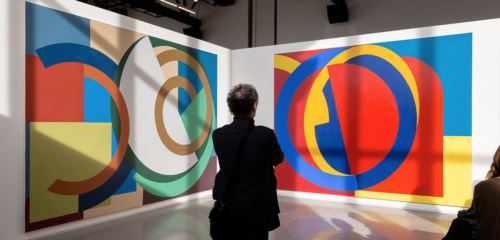
I’m not an expert on formal color theory, but I do know how color affects me and makes me “feel”. Color is tied closely in our psychology with certain feelings and moods. A piece of art that focuses on color can have a very primal connection to the person viewing it. Colors can, at their most basic, make you feel happy and boost your mood, like the colors in the paintings below. The colors are something that by themselves can make the painting work.
A long time ago I met a woman who was an art therapist. She used her knowledge of art and color on children who were sick in hospitals with long-term problems. She also used art therapy on adults. She used color as a healing property and to improve peoples outlooks. I believe that improving your outlook can improve your physical healing, which is why you often see a lot of art in hospitals. As an artist I have been part of many exhibits in hospitals and always received good feedback on the art from both patients and health care professionals.
You can even use art for the feelings it evokes to replace other things you do to improve your mood.
When some people want to lift their spirits, they reach for a bowl of ice cream. There’s a better way to improve your mood, though: color. Color is a powerful design tool that can make the rooms in your home feel more calm, cheerful, comfortable or dramatic.
Color makes a tiny room feel larger, or a spacious one feel more intimate, without the time and expense of actually moving walls. You can make a den feel cozy by painting the walls with a warm color, or make a narrow space feel wider by using different colors on opposing walls. The paint colors you choose, as well as the color of the furniture and accessories, all create a mood. “Color is all around us and even in our vocabulary. We say we feel ‘blue’,” says interior designer and color expert Elaine Ryan. “It’s part of our core, but for many years color has been excluded from our homes … but now I see a real love for it and people wanting it in their home. It’s all about finding the colors you respond to and that make you feel good.” There are colors that work for certain home styles, but don’t be afraid to be creative. Instead of using dark olive green on a Craftsman, go for a celery green that gives a fresh and lighter touch. “The power of color is that it can completely alter your experience,” says interior designer Shannon Kaye. “You always want to ask yourself how you want to look and feel in a space.” Deciding on colors for your home can feel like an overwhelming chore, but many paint companies offer online tools and paint collections that help you create a cohesive color palette. So don’t be afraid to experiment and use color! For example, here are interpretations of how two colors make us feel.
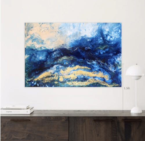
Blue
Blue, by far, is the most popular color in the US and is associated with trust, loyalty, wisdom, confidence, intelligence, faith, truth, and heaven. Blue slows down the metabolism and has a calming effect, so it is considered to be beneficial to the mind and body when used in the home or office. It is said that blue will help bring down blood pressure and slow the heart rate. Light or pastel blue can create tranquility and is associated with health, healing, understanding, and softness, but can come across as ‘chilly’ on the walls in a room that receives very little natural light. Dark blue represents knowledge, power, integrity, and seriousness. Deep midnight blue can create a feeling of luxury when used in a bedroom. Sapphire blues can be great as accent colors. Jackie Jordan, the Director of Color for Sherwin-Williams says, “Those brighter French blues and sunflower yellows are a fun combination for a kitchen.”
The colors in Dream Beach are mainly blue and cold, calming and uplifting colors
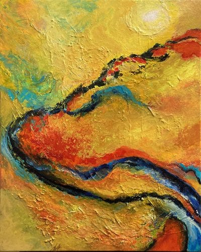
Yellow
Yellow is the color of sunshine and associated with joy, happiness, intellect, and energy. It is an excellent choice for kitchens, dining rooms, and bathrooms. In hallways, yellow can feel welcoming. However, studies show that people are more likely to lose their temper in an all-yellow interior, so it should be used sparingly. Dull or dingy yellow represents caution, decay, sickness, and jealousy and is rarely used in interior rooms. Light yellow is associated with intellect, freshness, and joy, and is a great outdoor house paint. Bright yellow evokes optimistic feelings. Interior designer, Jennifer Agus, of Agus Interiors says, “Yellow is an uplifting color, but you really have to pick the right shade. You want to make sure it’s not too bright or too muted…” But, for a sophisticated look, use deep yellow and gray. Yellow with orange are excellent choices for breakfast spaces, and yellow is great as an accent color in small quantities.
Here is an example of a mainly yellow painting – Temporal Rift
These are just two suggestions of color use. I know this color psychology works for me. Blue and green make me feel calmer, as do beige and pink.
When it comes to using blue or yellow or orange or pink for me, I like the colors strong, not pastel, unless I’m doing a watercolor painting. That is another aspect of using color – whether the colors are strong or pale. More intense colors, in most people’s eyes, probably evoke a stronger more immediate reaction. Think of a pale, pastel green jungle scene and then think of an intensely green jungle scene painting. Which one is more evocative of the real thing and makes you feel like you’re really there? Obviously, the more intensely colored one.
There is a similar reaction to abstracts.