Impact-Site-Verification: 0e1c0146-48e5-4b1b-b10b-c998fd9cdb48
It’s my opinion that paintings look wonderful – often best – in groupings of several, close to other paintings. So I was delighted to find this guide from ArtSpace. There is more to the article than this, so be sure to read it here.
“Taking its name and appearance from the salons of the 19th century where dozens of artworks were squeezed together onto the walls as part of academic competitions, the salon-style hang looks effortlessly boho chic when done well—but can be very easy to mess up. After all, hanging more than a few works on a single wall requires careful consideration of many make-or-break factors: spacing, proportions, frame styles, color pallets, and composition. Here, we’ve put together a guide to help you master this all-important display strategy, which can make a large wall look attractively full without having to pay the big bucks for a giant, expensive artwork.
[Not that we would discourage you from doing that!]
GETTING STARTED
For those lucky enough to have huge, un-hung collections, beginning your salon-style wall will involve laying artworks on the floor to see how they might fit together. With all your puzzle pieces laid before you, you have the advantage of visualizing your options before tapping in a single nail. But for many of us who are slowly developing our collections, our salon-style wall may come together piece by piece. If buying works specifically for a salon-style wall, consider giving yourself some collecting guidelines.
There aren’t any hard and fast rules here, and the most important thing is that you love each and every artwork—if you stay true to your style, chances are your wall will come together organically. But if you need a little nudge to get you started, consider organizing your collection around a single theme, whether that theme be based on aesthetics or subject matter. Here are a few options to mull over:
Theme #1: Portraits

Historically, salons of the 19th century most often showcased portraits and landscapes painted in oil. For an updated take on a classic, fill your wall with a wide range of contemporary portraiture. Here’s a collection of portraits that would look great together.
Theme #2: Black and White
If you’re worried about your arrangement being too garish or clashing with the rest of your room, go for punchy, graphic, black-and-white pieces that are varied in texture and medium, but limited in color. This option is great for more minimalist or industrial chic homes. Here’s a collection of black-and-white works that are sure to add sophistication to your any room in your home.
Theme #3: Monochrome
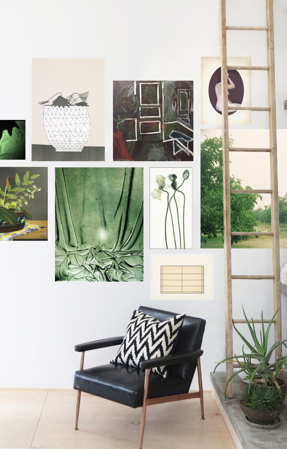 All pictured works are available on Artspace. (Rendering not representative of scale.)Make a statement with color. Use our Color Theory 101 guide to figure out which hue will best compliment your room, whether you’re going for an analogous, complimentary, or triadic color scheme.Then, collect some works that share the same color, and pull it all together by adding in some pieces in neutral tones like cream or gray. That way, your wall won’t be overwhelming and instead will offer a few carefully considered pops of color. Interior designers couldn’t be more excited about emerald green this year—a color that has traditionally been ignored by décor and fashion enthusiasts until now—making it a great choice for those on the cutting edge. Here’s a collection of green and cream colored works that together look as edgy as ever.
FRAMING

For a cleaner, more streamlined wall, opt for thin frames in just two or three different finishes. Varying margins on your mat boards can add variety to the overall look. And, you can lay unframed paintings and framed photographs and prints side by side without having either one feel out of place.
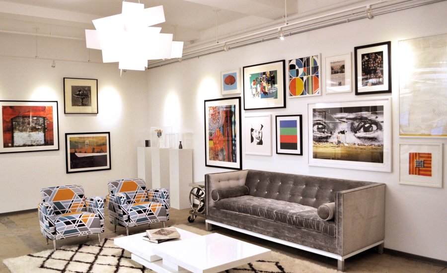
If you’re going for a more old-timey feel, with portraits and landscapes in oil, vintage and ornate gold frames can look great—but since some will probably be quite thick, don’t crowd the thick frames together but instead have them dispersed throughout the cluster. This option looks best on dark colored walls.
FINDING THE RIGHT WALL

Do you have a small or irregular wall? In this case, you may consider filling the entire wall with artwork, floor to ceiling, spanning the entire width. This doesn’t necessarily mean cramming it with artworks, however—you can easily space out the arrangement to fill the space in a balanced way with out blowing all your cash on a slew of works.
When working with a large wall, like one found in a loft space, large living room, or open floor plan, hanging art can create a focal point, concentrating interest in one particular area to help guide your eye around the room. So rather than fill the entire wall like you might with a small or irregular space, hang your cluster above a couch in a living area or a headboard in a bedroom. It tends to look best when the artworks on the edge hang just beyond the edge of the couch or bed frame.
[/et_pb_text][et_pb_post_nav _builder_version=”3.17.2″ prev_text=”%title” next_text=”%title” in_same_term=”off” title_text_color=”#c40065″ divienhancer_set=”none” divienhancer_hover_effect=”none” divienhancer_sticky_module=”none” divienhancer_modal_overlay=”#333333″ divienhancer_module_menu_button_background=”#333333″ divienhancer_module_menu_button_color=”#ffffff” saved_tabs=”all” global_module=”52167″ /][/et_pb_column][/et_pb_row][/et_pb_section]